


ASI reveals new logo
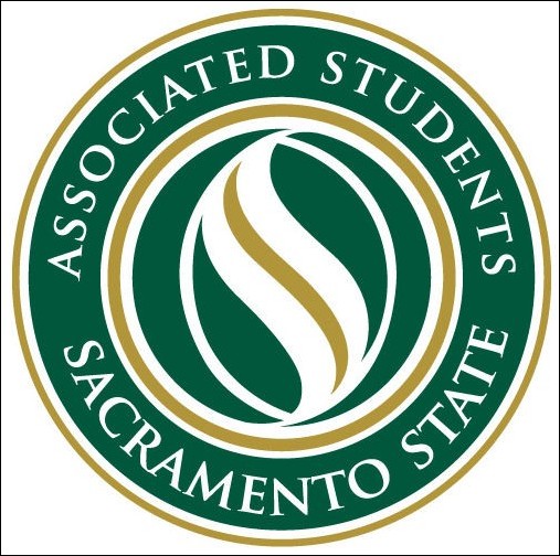
Image: ASI reveals new logo::
April 6, 2006
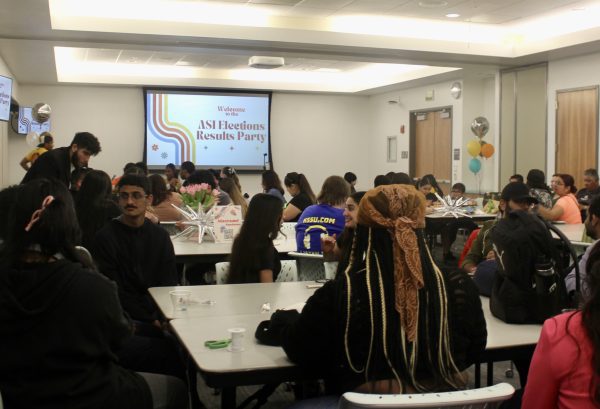
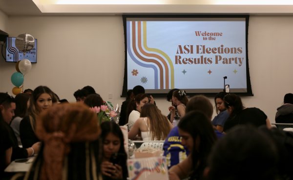
Associated Students, Inc. unveiled its new logo on April 6 at a rollout party in the University Union Ballroom.
The logo was revealed after the campus’ first annual State of the Students Address speech by ASI President Angel Barajas with an introduction by President Alexander Gonzalez.
With spotlights circulating the room, music playing and free T-shirts being given to the audience, the new logo ?” which is a gold and white “s” inside a green and gold circle that reads with the words “Associated Students” and “Sacramento State” ?” was revealed.
“The new design comes at a time when we are trying to reform our physical appearance and some of our operations and will help give us a fresh start with fresh ideas,” said ASI President Angel Barajas.
Some students liked the new vision of ASI.
“I like the ‘s’ (in the logo). It puts the emphasis on ‘students’. I like that,” said Christina Romero, who is currently running for director of Arts and Letters.
Other students were expecting a different look.
“It looks a lot like the school logo. I was expecting something a little different,” said Kerby Boschee, a senior majoring in sociology.
Frank Whitlatch, associate vice president of public affairs, said everyone involved with the process of creating and picking the new logo did a great job.
“ASI is obviously an important part of the university but at the same time has its own identity. There were some key themes involved, and this logo really does it,” Whitlatch said.
Osaki Design ?” the design company who redesigned university’s logo ?” created the new logo as part of an identity package for Sac State. Osaki began creating the new logo in January.
Free giveaways included food, pens, stickers of the new logo and T-shirts.
Max Puckett can be reached at [email protected]