Best and worst of professional uniforms
September 14, 2010
U-G-L-Y. You ain’t got no alibi, you ugly.
When those cheerleaders chanted the infamous song that was written by Daphne and Celeste, they were probably talking about the players’ uniforms. Over the years, sports franchises, whether pro or not, have come out wearing some of the coolest, strangest and downright ugliest uniforms ever. Here are the good, the bad and the ugly of sports uniforms.
The good
Los Angeles Lakers:
Nothing says bow down to basketball royalty quite like gold and purple. Basketball’s greatest have donned these famous colors, and they have won 15 NBA Championships8212;so it shouldn’t be a surprise that they wear uniforms that practically scream swagger.
New York Yankees:
Pinstripes have always been a symbol of professionalism and sophistication. The Yankees dawn the navy blue pinstriped white uniforms at home games, and with their Tiffany-designed NY logo, they practically define the term champions. With their classy outfits, they are like those popular kids in school who get everything they want because they look the part. That could also be why they have brought home 27 World Series titles.
The bad
Cleveland Cavaliers:
Before LeBron James became the face of the Cavs, they did not have a good look going for them. Dull, boring and uninspiring are just some of the words that come to mind when looking at the Cavs early 1990 uniforms. First, the entire uniform is plain white. Ew. Second, the only form of embellishment on the uniform is a baby blue stripe diagonally smeared across the chest with “Cavs” written in gold above it. They are extremely horrendous. Double ew.
Golden State Warriors:
Apparently the 1980s Warriors thought the fans needed a geography lesson on their jerseys. Along with the style of short-shorts for men back then, the tank jerseys were the most hideous mustard shade of yellow. The yellow was complimented with a dull blue circle-globe-like graphic and a cut out of California, with a star near The Bay, in case their loyal fans didn’t know where the heck they were located. Calling their fans dumb? Kind of seems like it.
The ugliest
Houston Astros:
The 1980 Houston Astros wore jerseys that someone puked orange, yellow and red stripes on. If that is not enough of a visual for you add a giant star on the left side of the front, and you have one of the ugliest uniforms. Of all time. Maybe the game plan when creating these uniforms was to blind their opponents. That seems pretty logical to me.
Pittsburgh Pirates:
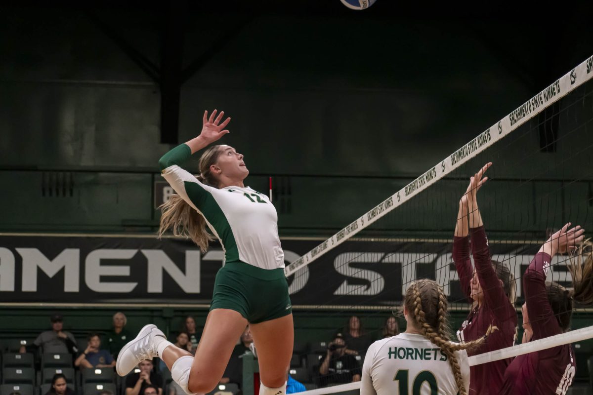
Now Sacramento State knows how to rock the Bee style, but 1976 Pirates could have used some lessons. They rocked the yellow and black, and it did not work for them. Seriously though, the hat8212;black with gold circles wrapping around8212;alone should have been burned and never seen again. They didn’t seem to understand just how ugly these uniforms were though, because they tried to rock that wretched uniform for 10 years.
Denver Nuggets:
Simply put, whoever thought it would be a fashionable idea to silhouette a skyline against a rainbow on a basketball jersey was seriously mistaken.
One thing that can’t be denied is the designers of athletic uniforms have plenty of creativity, although it is not always executed properly. Those cheerleaders had the right idea when they took to that song and turned it into a cheer. U-G-L-Y. Seriously ugly.
Cassie Kolias can be reached at ckolias@statehornet.com


