


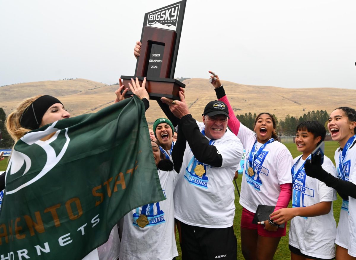


Sac State rebrands the logo for clearer meaning
May 10, 2015
“I think that Sac State’s logo should be a little bit clearer,” said junior communications major Sam Gumbinger. “I know that there is a torch somewhere in the logo … Since the hornet is our mascot, shouldn’t it also be in our logo?”
A newly updated identity style guide, found on the university’s website, explains what the different components of the school’s logo means and how to use it correctly.
The torch, or the double S, represents the flame of knowledge. The shield represents tradition with the arch in it signifying the Guy West Memorial Bridge. The two wavy lines under the shield show the two rivers of Sacramento: American River and Sacramento River.
After finding out what the different parts of the logo are and what they mean, Gumbinger believes that it sends a thought-provoking message that most Sac State students should be made aware of.
The logo was officially used starting in 2005, after the previous university logo which looked similar to the Seal of California.
Communications professor Miles Cochran spoke to his critical analysis of messages class about the impact that the logo is supposed to have on students.
“The rebranding in a lot of ways, is about how to describe the culture of Sac State. The creation of new iconography, literally new icons and pictures, represent the school and the way for us to hopefully shrine our value system into the new system…If the people in this community don’t understand why or how we did it, then it doesn’t really serve those purposes,” said Cochran.
He explained that as a critic, one can look at creating the logo as an ideology. Does it actually get represented? Is it actually effective?
“So while I think a lot of the ideas were really really good, I’m not sure if those values are actually represented,” said Cochran. “Or they didn’t get represented in a way where teachers and students understand. There’s a lot of talk about how it’s a torch because we’re lighting the way for future generations…If you go on a tour that should be that kind of thing that should be brought up. There’s almost no chance you would run into that information.”
The tour guides, who welcome incoming freshmen and transfer students, learn what to say through a set of talking points made by the university’s Admissions and Outreach department.
“We don’t explain what the logo means but we do mention Herky the Hornet. When we have younger audiences, we teach them to have their stingers up instead of raising their hands,” said tour guide and junior nutrition and food major Lizethe Cardenas. “We also talk about how our mascot is a hornet because bees sting once, and they die. Hornets will keep stinging and don’t give up.”
The new identity style guide is currently accessible but is still being developed by the university Public Affairs department in order to translate the language for clearer explanations on how to correctly use the logo.
“We’re hoping to have the website fully functional and finished before the semester ends,” said public affairs and advocacy marketing director Becky Repka.
Further logo explanations and instructions on how to properly use it can be found at csus.edu/brand