


On Second Thought: Sac State’s logo
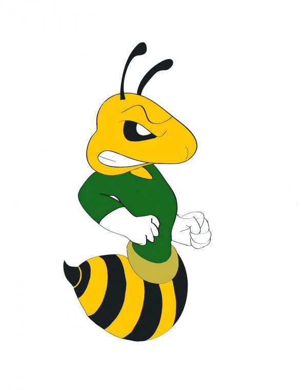
Gabriel Pacheco’s proposed logo design.
April 18, 2012
David Somers

In sports, the logo a team chooses can go a long way toward establishing its image and uniting a fanbase. Sacramento State needs to take a hint from other universities and ditch its current logo in favor of a better one.
The repeated, long-standing success of certain schools has helped transform their logos into icons players and fans rally around. Some examples are Alabama’s elephant Big Al or Notre Dame’s Fighting Irishman.
Yet other teams without the same successful history have still found creative and effective ways to identify themselves and connect with their local fanbase. The UC Santa Cruz Banana Slugs come to mind as well as the Oregon State Beavers.
Sac State’s logo lacks both these principles. There is neither a historic significance attached to it nor a single creative aspect about it with which local fans can relate.
In its current form, the Sac State logo appears to be a hornet in the shape of an “S” with a stinger at the bottom and two bat-like wings protruding from its sides. It looks more like a nondescript earthworm eating through an apple core.
If the university wants to stick with the Hornet moniker – though I’m not sure it should – there has to be a better and more appropriate way to design a hornet than this. Even the goofy New Orleans Hornets’ logo would be preferable to Sac State’s current brand.
The school should get creative and design a catchy new logo with a swarm of hornets in the shape of an “S” that would symbolize the concept of team unity through individual effort.
A change is something the school should strongly consider. A new logo might go a long way toward helping this commuter school better identify with the community.
David Somers can be reached at [email protected].
Gabriel Pacheco

A logo says a lot about a school and the pride that comes along with it.
But it also can play as a figure people can potentially remember after a visit on the school’s campus.
When evaluating the current logo of Sacramento State’s, it lacks in quality and creativity. It does not represent the school the best way it could.
When people look at the school’s logo, all they see if they can figure it out is a capitalized “S” with a pointed tip and wings on the side.
There is no strong connection of showing Sac State is the home of the Hornets.
A logo should be designed with the intent on capturing a person’s attention as they walk pass it.
Most importantly, it should create some type of connection with that person.
Comparing the quality of Sac State’s logo to the standards of Duke University there is none.
There is no sense of pride in the logo, it is just embarrassing to have.
Duke has not only its patented blue “D” logo, but its school’s blue devil mascot is represented and fitted in the inside of the letter to make it stand out even more.
They have also been able to branch off their school’s logo by creating a slogan to go along with it, “The Cameron Crazies.”
The best thing our logo can try to do is incorporate a more noticeable hornet to solidify Sac State because the current logo doesn’t.
Sac State has a department of design with the ability and creative prowess to generate a better logo.
Sac State’s logo should represent the university the best way it possibly can.
The current logo just falls short of memorable.
Gabriel Pacheco can be reached at [email protected].
JJ Williams

Sacramento State’s current logo is at best logical, but it does not demand respect from opponents and it is certainly not the ideal image for creating a brand.
When Sac State’s founders chose the hornets to represent the university, they did not give themselves much to work with as far as the logo possibilities go. However, with a logo makeover to the current Sac State logo of an “S” with wings this university could become a well-known brand name within the community.
Although Sac State lacks the longevity and traditions of schools like the University of Notre Dame or the University of Southern California, the school needs to have the same kind of brand name. Similar to the University of Florida’s gator or the University of Texas’ longhorn, the hornet logo needs to be associable with Sac State on sight.
My hornet logo is more sleek and professional looking. The stringer is sharp and it looks focused while fierce. Basically, this hornet should have a tie on because it means business.
This is the kind of logo we should have on our equipment, uniforms, fields and courts. This university needs a brand, something that when people see it out in the community they instantly recognize it.
The logo is a direct representation of the university. It should display creativity as well as the professionalism the university has to offer. The current logo is too bland, it does not present the bold characteristics Sac State needs as the university tries to shed its “commuter” school image.
I believe my logo makes a bolder statement. It demands more respect and would create greater university recognition – everything a brand aims to do.
JJ Williams can be reached at [email protected].