


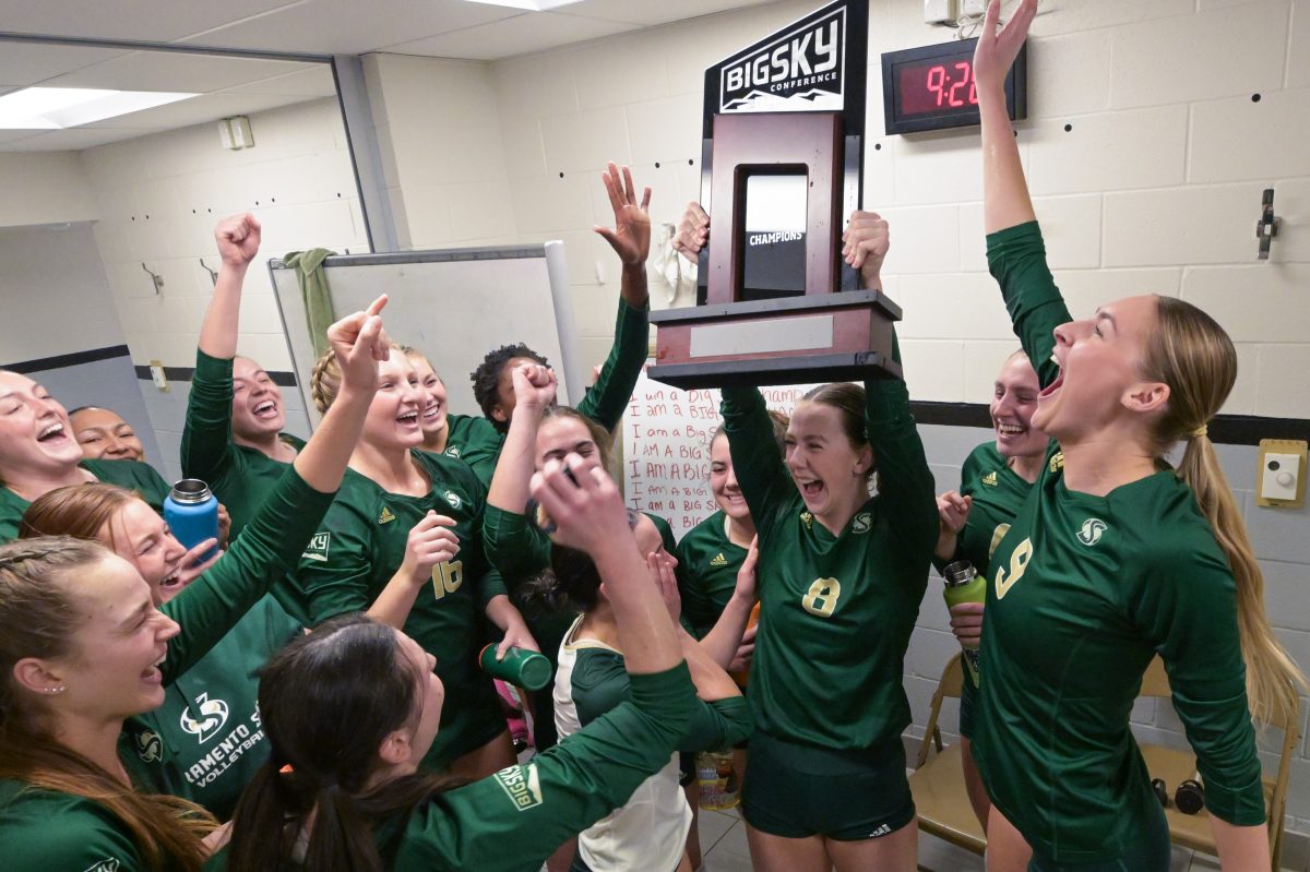


New campus logo deserves 2nd glance
September 21, 2005
It has been three weeks since the unveiling of the new Sacramento State logo, designed by Osaki Design. Reaction to the new logo has been mixed. The new logo appears as a torch accompanied by a flame in the shape of a double “S.” Sac State President Alexander Gonzalez’s goal with this logo was to give the university a unique identity and to continue his “Destination 2010” plan. But why so much criticism?
One argument I have heard from students is the design is poor. “It looks less official than the original logo,” said senior criminal justice and English major Christina Crabtree.
While first impressions may be hampered by a mere distaste for change, some do like the new logo, including me.
“I like the new logo. I think it looks streamlined and elegant,” said Art Professor Rosi Gilday.
Obviously satisfaction or dislike of the logo is, and will always be, based on opinion, so it’s unfair to criticize it as ugly. Other students have questioned why the graphic design department wasn’t involved in the logo. These students argue the graphic design department could have completed a comparable logo on a much smaller budget. The graphic design department doesn’t exactly agree however.
“Without knowing all the details of the contract it is not possible to judge the cost of the redesign, but we stress that good design can cost large sums of money, since it requires many man-hours of research, design, review and study,” said Graphic Design Professor and Coordinator Gwen Amos on behalf of the department. So, scratch that argument off as well.
Furthermore, Gonzalez wanted a well-known and reputable design company to create the “destination 2010” logo. Osaki Design may not ring a bell, but their other works will.
The company was responsible for recreating both the San Francisco 49ers and Miami Dolphins official NFL logos. So you can bet that Osaki design was qualified for the job.
The goal of the logo was to capture a unique identity for the school and it accomplishes that goal. The simple yet appealing design captures many of the aspects that Sac State has been known for.
For example, the river on the bottom embodies the American River, the torch symbolizes Olympic stature (summer Olympic trials), and the double “S” flame is for Sacramento State.I encourage students to try and remember the old logo. For those who don’t, it was simply the California State Seal, replaced with “Sacramento.” Boring? Yes. Unoriginal? Definitely.
The new logo addresses and solves these issues. So, check off the idea that our old logo was better. The new logo isn’t going to change anytime soon (we don’t need another $34 thousand spent on a re-redesign), so I encourage all students to embrace it.
“We applaud the university for being considerate and proactive in their communication strategy and realizing it is up to any institution to communicate a well conceived, coherent message through their visual presence,” said Amos.
In the end, the logo’s appeal is still a matter of opinion, but it represents all students and faculty of the university, so let’s show some pride.Andrew Stiffler can be reached at [email protected]